Jordan Shields Design: A Case Study
We had the pleasure of studying Interior Design at SCAD (Savannah College of Art and Design) alongside Jordan Shields, and since then it’s been so incredible watching her LA-based interior design practice grow. Known for striking balance between old and new (but always with a nod to LA’s tropical vibe), Jordan Shields Design is well on its way to becoming a household name.
While Jordan had worked with a graphic designer at the start of her business, higher-end clientele forced the hand on needing an elevated branded experience. We started by expanding on her existing brand elements so that she would have greater flexible on a variety of print collateral assets, like: note cards, envelopes, and stationery.
Here’s a look at the client’s original logo:
Jordan’s equestrian background inspired the horse bit to be her icon, with no other design element apart from staying consistent with Futura font.
”I have had a lot of positive comments about how I take time and and go the extra mile to make sure everything is finished off properly on projects. I would like to also have that reflect on everything that is associated with my business like packaging and branded items I hand out.” —Jordan S.
Before we started the process, Jordan was asked to answer a few discovery questions:
1. What is the purpose of your business and what message are you trying to send to your clients?
”I want to create a full service interior design service that feels sophisticated, professional, with some elements of fun but overall more of a luxurious and sophisticated feel.”
2. What’s on your “brand refresh” wish list?
”- Having a solid logo and logo with type.
- Having logos/branding that can easily be applied to a variety of applications.”
3. What kind of experience do you want people to have after they encounter your brand (takeaways, feelings, etc.)?
”I want people to think that it is thoughtful and that time was taken on everything related to my business, and that will be applied to any project I work on. I always love the experience of luxury products packaging and branding. I really appreciate when everything from the tag to when the receipts placed in an envelope or just on a paper that has some weight to it and different.”
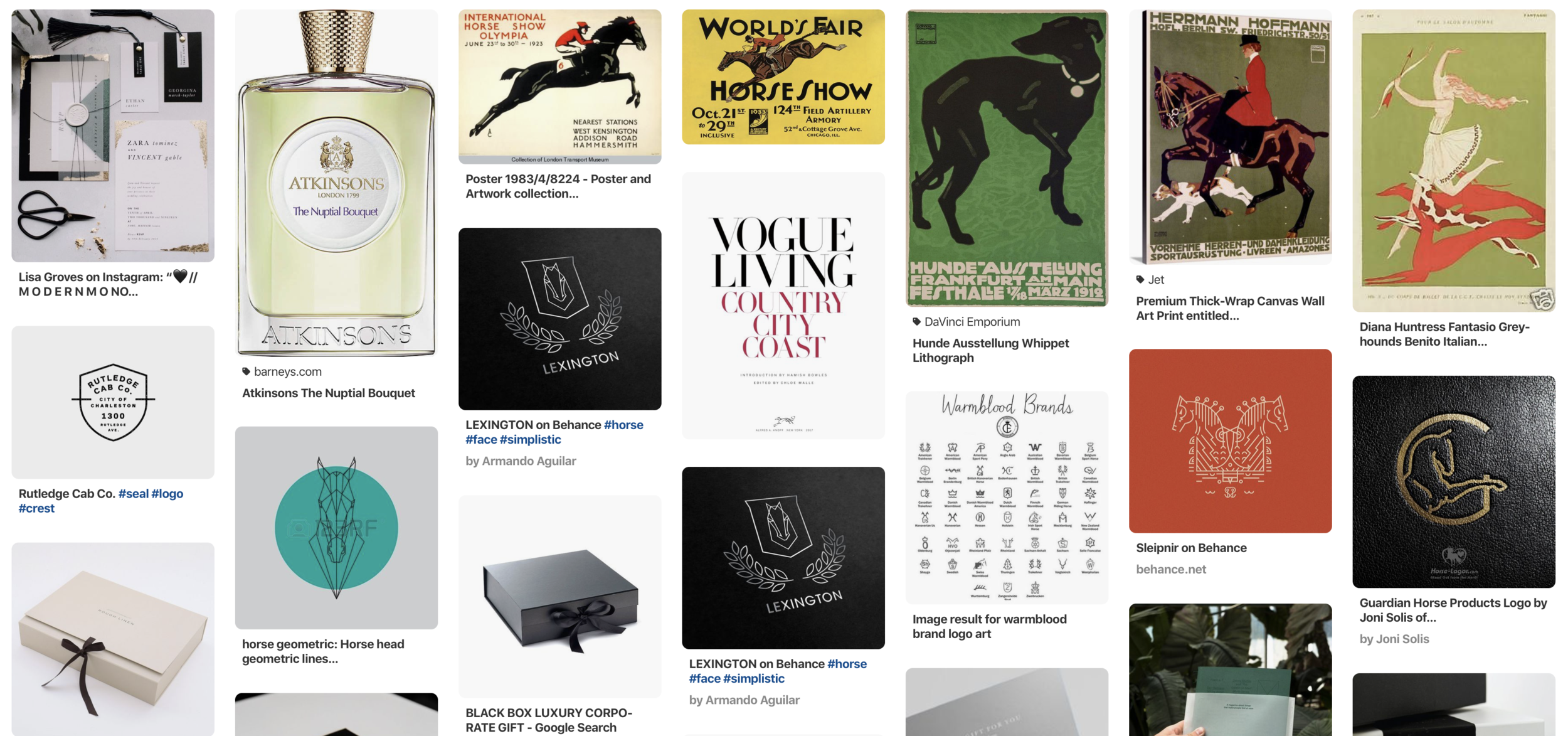
We also asked for Jordan to start collecting inspiration on Pinterest. Pins could be examples of other logos, old movie posters, packaging, or anything that struck her as “on brand” that could provide design direction for her new identity. Our team went through this Pinterest board with her so that we could call out reoccurring themes or ask questions about certain images.
Based on the discovery questions, initial video call, and the client mood board, we had enough information to assemble a curated Aesthetic Direction presentation, which includes:
+ Mood Board
+ Color Palette
+ Initial Identity Concepts
+ Collateral Mockups


We were inspired by the neutral color palettes found throughout Jordan’s Pinterest board, especially when mixed with a “stamped” strike of color, seen above in the Celine business card. Her palette gives room to either tone down or brighten up her brand depending on the application.
The first take at her logo married equestrian elements taken from her previous logo alongside a more stately, “household name” aesthetic seen in some of the most prominent fashion design houses.

We then expanded on this “primary logo” and create several secondary marks, all intended for different applications. Below you’ll notice that the primary logo was further developed into what’s on the top of the page.
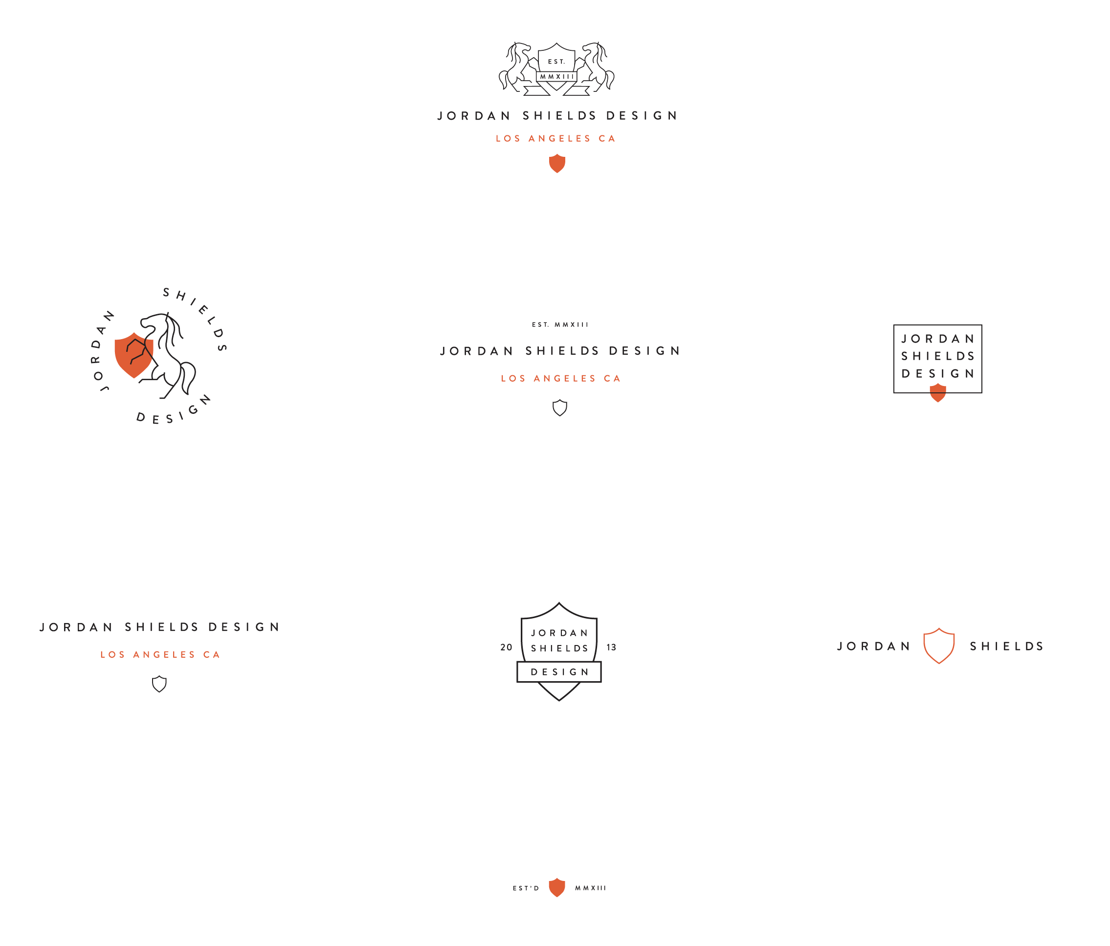
The client was pleased with the direction, but wanted more detail in the horse silhouette. This led to a series of sketches to get the horse shape just right.

And out of that collaborative process, the identity was finalized:


Are you ready for a brand refinement like what we did for Jordan? Send us an email and let’s get started!